January’s topic was Zoology – the branch of biology that studies the animal kingdom. We asked you to create visualizations not only to aid teachers across the globe but to inspire their students, and we’ve been overwhelmed by the incredible submissions we’ve received this month from the #datafam community!
Link to our Zoology Gallery with some amazing visualizations: Zoology gallery link
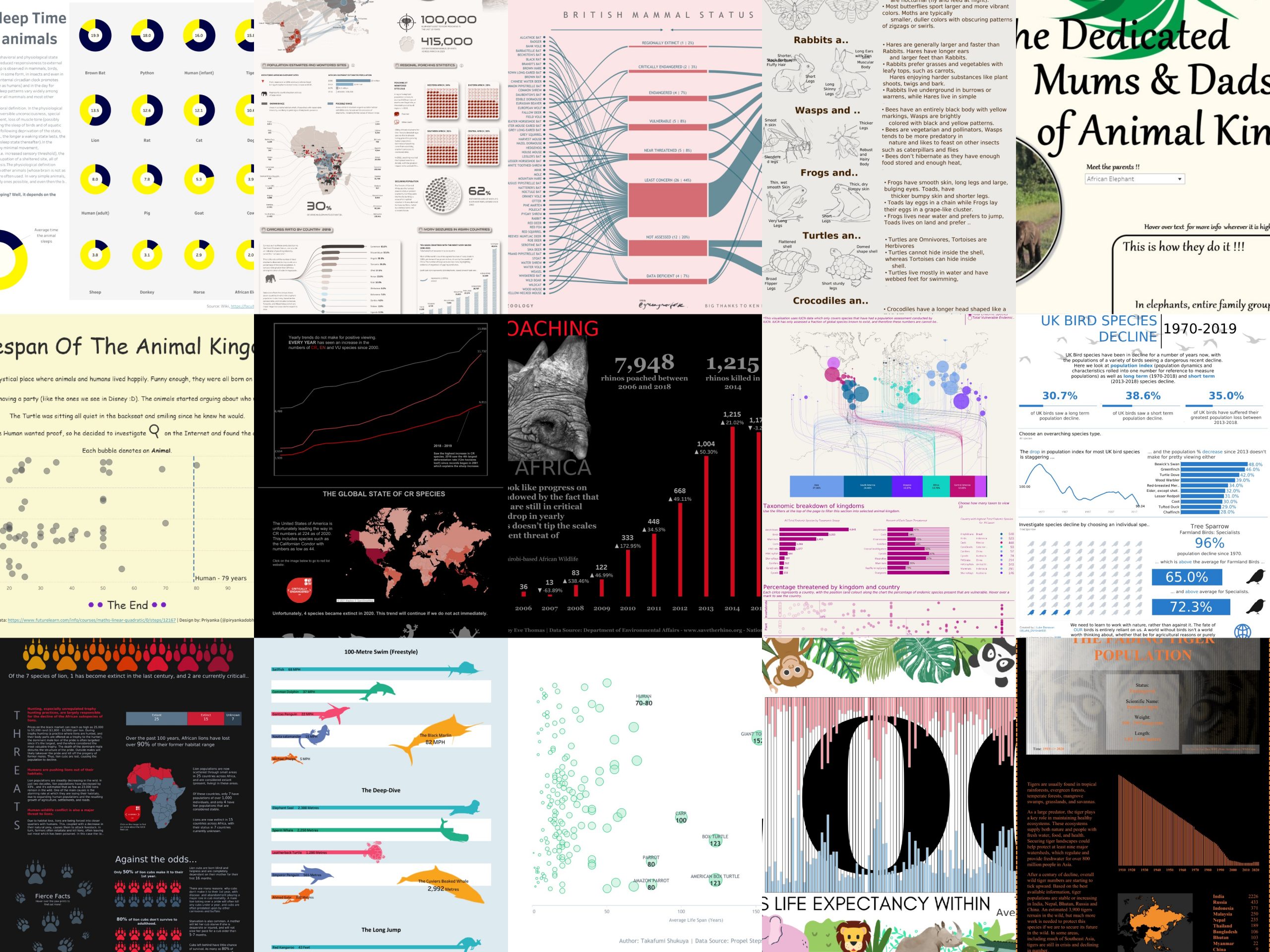
The first entry we would like to highlight is Jagruthi’s Commonly Confused Animals – fantastic for younger students we loved the simplicity of the design and the lovely illustrations. We also liked the fact that it was ‘poster style’ and could easily be printed off and displayed on a classroom wall – really great design!
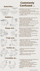
The 2021 Animal Olympics by Eve Thomas is another submission suited for younger students – (although we know that adults will love diving into this fun viz too!!). The bright colours and simple design make this fun to navigate and easy to explore. Have you ever wondered who would win at the 100-metre dash out of a warthog, a butterfly and Usain Bolt – check out this viz and find out!
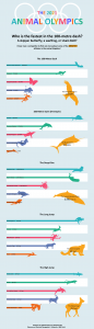
Adam Green’s British Mammals IUCN RED LIST is another favourite we wanted to highlight for this month. This design really stood out to us for it’s simple colour scheme, and clean layout, making it easy to read and interpret. Packed with information, this is wonderful addition to the gallery and will be a valuable teaching resource.
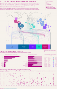
A look at the world’s endemic species by Theo Isaac was another submission that stood out to us this month. It’s packed with information not only making it an ideal resource for teachers, but also ideal for those students who have limited access to expensive textbooks.
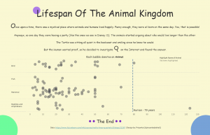
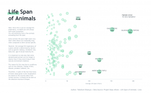
The life span of animals has proved to be a winning topic. Takafumi Shukuya’s Life Span of Animals gives us a clean and simple design in the form of a scatter plot. Easy to read for users of all ages this is a great addition to the gallery. Priyanka Dobhal’s Life Span of the Animal Kingdom is a great one for younger users – using a story-telling approach it encourages students to delve in and find out more! We love the addition of a reference line to make comparing against the human life span easy!
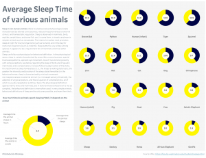
Sleep time of various animals is another interesting viz by Vinodh Kumar which looks at the time spent by animals sleeping in a day. Some interesting facts came out like giraffe sleeps only 2 hours a day and bats sleep more than 20hrs a day.
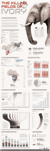
A majestic viz to create awareness for students on the ivory poaching that is reducing the elephant population by Naresh Suglani is a classic example of incredible storytelling , we believe this will be a great resource for students where they can understand the adverse effects of poaching.
All the entries we received this month were fantastic and will hopefully help towards our goal of empowering teachers and students across the globe. Again, we would both like to thank everyone in the #datafam who contributed to February’s topic of Zoology.
Link to our Zoology Gallery with some amazing visualizations: Zoology gallery link
This month (March) we are collaborating with #IronQuest on the topic of History – we are looking forward to seeing what you can come up with!
– By Eve and Vinodh